FaithQuest 2011_3

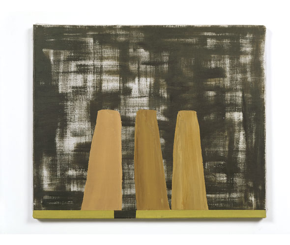
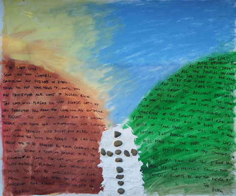
I like art that is physical.  I like different materials that must be handled differently than just paint.  I also like the idea that words can become a material to make an image, in this case two mountains.
God told Moses that when they got to the Promised Land they needed to recite the blessings and curses.  One group would stand on or in front of Mt. Gerazim and the other would stand on Mt. Ebbol.  In the middle would be stones piled up in an alter, with the law written on them.  Mt. Ebbol was barren and desolate, scorched by the sun.  Mt. Gerazim, however was lush and green- both places appropriately signifying the blessings or curses that would be spoken from them.
In acknowledging the universality of God’s plan, Troy Wagner spoke of the cross as being at the center, in place of the law that the rock altar symbolized.  So in keeping with my artistic preferences noted above, I thought, “What better way to include the cross while referencing the stones of the altar than to use actual stones?”
So it’s pretty straightforward, then- desolate Ebbol is in yellows/browns/reds while lush Gerazim is in greens.  The shapes of the mountains are formed by the words of cursing and blessing found in Deuteronomy chapters 27 and 28.  
There is also a detail a bit more subtle.  In art- everything should be expressive- the color, the texture, even seemingly insignificant details like the brushstroke.  Here, the brushstrokes on the ‘blessings’ side stay pretty even going and back and forth.  The strokes on the ‘curses’ side, however, go every which direction in a more chaotic way.  

Faith Quest 2011_2

When I first started thinking about FaithQuest this year and the theme of God’s people travelling, I immediately thought of an artist named Jacob Lawrence.  He was an African American artist who came to prominence in the 1940s by painting a series of paintings based on the migration of African Americans from the South to industrial centers in the North.  He had a simple yet powerful style that strikes me in its forcefulness in the way he arranges his scenes and his color combinations.
Laundress by Jacob Lawrence
            So I wanted to try to imitate that simplicity and let the colors and arrangements carry the story.  So here we have Rahab living in the city wall, the spies hiding on the roof, and city officials coming to inquire about them.  Rahab bows in submission to the authorities while pointing that they had moved on down the road.  Her finger, and the road, leads your eye to the horizon- a phrase that Brian Simmons repeated, “Keep your eye on the horizon, looking for Jesus.”
            There’s all types of artsy things going on in this one.  Just like you learn in school to arrange your essays into paragraphs, artists have different organizational schemes.  One is the ‘L’ shaped composition- which I play with here (only here the ‘L’ is turned around upside down backwards- it follows the sky along the spies and drops down along the wall on the right.)  The trick is to relate the ‘L’ to the resulting inset rectangle.  Here I’ve used Rahab’s pointing hand to cross both areas and the wall extending up into the sky.
            Color also plays a role.  I wanted an anxious color as a backdrop to the city officials so a red-orange does the trick.  Rahab is also clothed in that color (the ‘lady in red’) which also indicates where she’s from.  But she has an underlayer of purple and skin tones to match the spies that she is aligning herself with. 

            Here’s something interesting that happened.  When you paint, you have a vague idea (sometimes) of what you’re trying to do.  But you also want to be aware, and ‘watch yourself’ while you paint.  Oftentimes you will see something in process that expresses more clearly your original idea.  In this case, I had started a rough outline of the spies in hiding, intending to fully color them in with colors tying them to Rahab.  But I actually liked the idea of them being somewhat transparent- almost hiding from us, the viewers, as well.  So I threw some color in to keep the color associations but left them primarily transparent. 

            I could probably go on with other associations and things I thought about – some premeditated, some discovered after the fact.  But the real point is the amount of thought that goes into a work of art.  Maybe we would do well to put as much thought into our own lives.  Both thinking ahead of time how and who we will be.  But also being aware (looking on the horizon for Jesus) and making adjustments in the process of living.

FaithQuest 2011

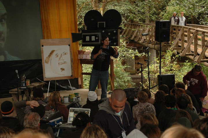
Every year Melinda and I help out at a youth event called Faith Quest. We help design and build the stage setup and then I do a series of paintings while the featured speakers give their talks. This year the theme was the Oregon Trail and the talks centered around the Israelites journey into the Promised Land. Troy Wagner presented the opening lecture on the relationship between Joshua, who led the Israelites, and Jesus who leads us.

What’s in a name? The Hebrew word for Joshua is Yeshua. When you translate that into Greek you get the name Jesus. Joshua led God’s people into the promised land. A land that they did not earn; a land they merely received based on God’s promise to Abraham. Jesus also leads us into a promised land. It is also a reward that we didn’t earn. I think there is significance in the name of Jesus. Literally it means ‘He Saves.’ And it was just as true for the ancient Israelites as it is for us.

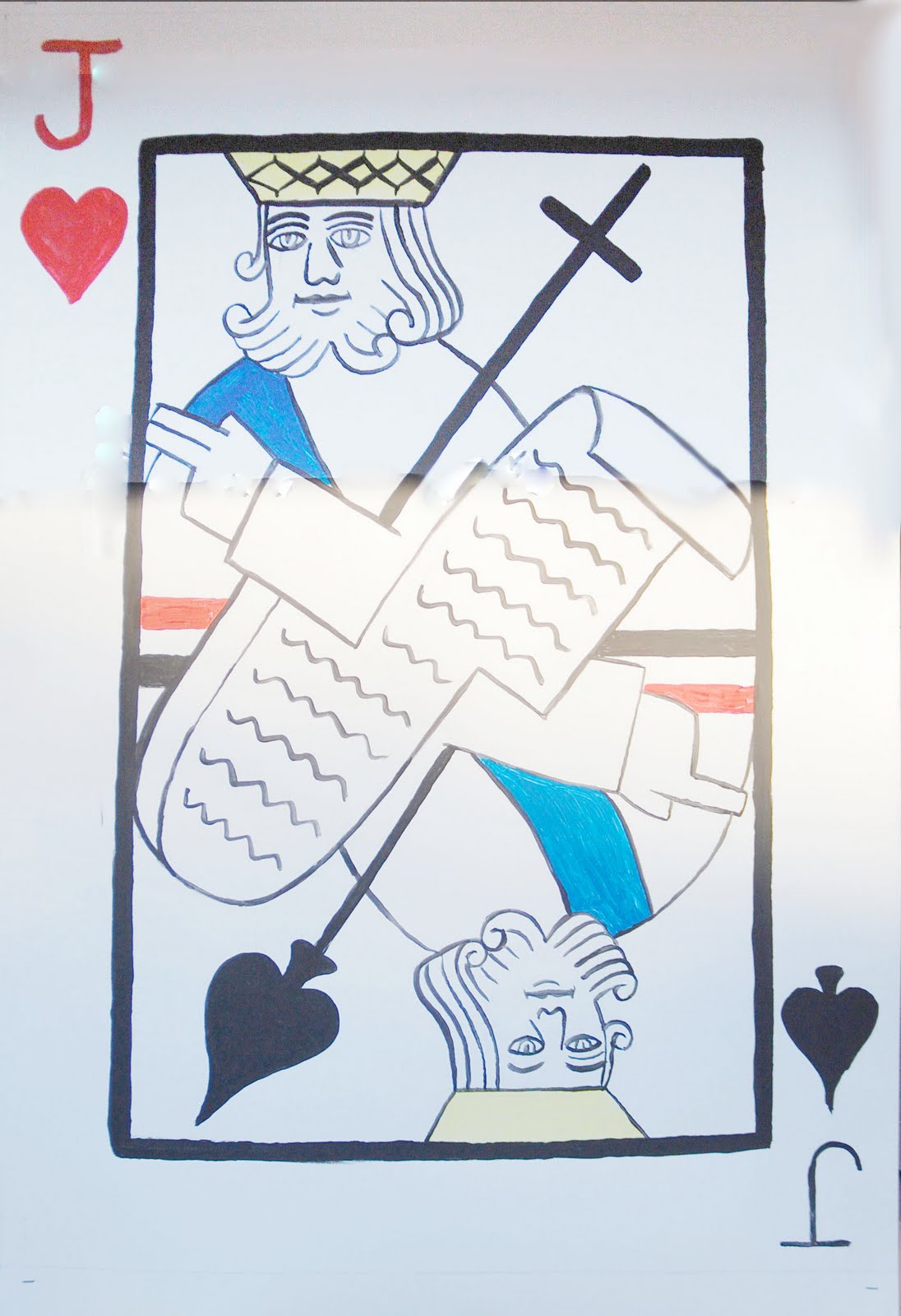
So God is beyond time. There is no backwards or forwards; beginning or end. So how do you visualize that? How do you show an eternal plan with no beginning and no end? And yet there are two individuals that serve as signposts to this larger picture. Two individuals that share the same name. And it occurred to me that playing cards have this sense about them. No matter which way you turn them they are always ‘right side up.’ They never end.

So then all these things came together- I used a king’s face because Jesus is a king, and Joshua acted in a kingly role in leading Israel into the promised land. But then I made it a ‘Jack’ since their names started with ‘J.’ Throughout the NT you see references to what the “Law and the Prophets” said. Joshua carried the Law- the stone tablets- with them into the Promised Land. Jesus announced his ministry with the reading of a scroll from the Prophets- proclaiming release for prisoners and sight for the blind.

To emphasize the inclusiveness of God’s Kingdom I also thought I would represent both black cards and red cards. So Jesus has a heart (because, you know… the whole ‘Jesus loves you’ thing) and Joshua is a spade because it serves as the point of his spear as he leads the Israelites into battle. His finger is pointing to lead the charge. Jesus has two fingers pointing in blessing. I’m not sure where it came from but whenever you see pictures of Jesus from, like, the Middle Ages and in icons from Eastern Orthodox traditions you have everyone raising two fingers in blessing. I thought I’d allude to that artistic heritage as well. Also, instead of a spear, Jesus leads us by example through His death on the cross.

Hopefully this gives you a different way to think about Jesus, Joshua, and God’s plan. But here’s something else about the power of art: by taking the image of a playing card, the next time you’re playing cards you just might remember this painting, and thus think about Jesus.

The Best Advice I Ever Received

I’ve been thinking a lot about marriage recently.

It’s something Melinda and I talk about quite a bit, actually.  But we don’t just talk about our marriage- we talk about marriage in general.  And I think that is key.  And it reflects a perspective I gained when hearing what I consider to be the best advice I’ve ever received.

Melinda’s father performed our wedding.  But living in a different state at the time, he could not have us in a full pre-marital counseling program that he usually liked to have with couples.  But there were a couple of things he really wanted to say to us so one time while they were out visiting before the wedding, he gave us his ‘crash course’ in marriage.

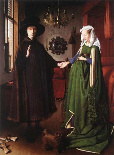
The Arnolfini Wedding by Jan Van Eyck

Now, I’m all about gaining new perspectives.  It’s what fascinates me about and draws me towards art.  Because you are able to gain new conceptions of seemingly mundane, ordinary things.  We all have ideas about how things are supposed to be.  Whether we’re fully conscious of it or not, we have images in our head- be they abstract signs of relationships or clear pictures of people, examples that embody our ideal.  I wasn’t really conscious of my images of marriage at the time- most likely I had pictures of my parents’ relationship.  But I was about to become aware of a new vision, a new conception of marriage that continues to affect me to this day.

In this ‘crash course,’ my future father-in-law said that in marriage there are actually three commitments- one is to God, one is to your spouse, and one is to… marriage.  Having grown up Christian, the commitment to God was a no-brainer.  And the commitment to your spouse?  Duh!  But a commitment to marriage itself gave my brain a little twist.  Marriage was a separate entity that was beyond Melinda’s and my relationship to each other.  But that separate-ness has made a huge difference in our relationship.

We all get mad at our spouse.  We are never going to agree all the time.  And sometimes it is difficult to love the other person. And for those reasons, if the marriage is only about your relationship with that person- how you’re feeling towards them, or how they’re feeling about you- then I fear the marriage could very easily be derailed.  But when I think about the marriage– about what is required for a good marriage, then a whole new dynamic develops.

I’ve noticed at least two main benefits from taking this perspective.  First, I’ve done things that I wouldn’t have done just based on my moment-to-moment feelings.  It has compelled me to stand back and look at what a good marriage is and given me a yardstick with which to measure my performance.  If I just stayed with how I felt, I could probably come up with many things to complain about.  Perhaps those complaints would develop into anger and bitterness.  And, of course,  I’m sure I would never be at fault because we never blame ourselves when we’re just looking at our feelings. Right?

The second benefit is thankfulness.  When I compare my performance with a yardstick that is not emotionally charged, I find all the ways in which I’ve been a poor, miserable slouch (to put it mildly) and I feel truly thankful and blessed that my wonderful wife has put up with me and still chooses me on a daily basis.  But wait- what happened to all the blame and hurt and bitterness alluded to in the last paragraph?  That’s right, it can’t be sustained when you have a clearer picture of things.  And when I’m truly thankful for my wife, it’s MUCH easier to love her than when I’m angry at her.

So to sustain a good marriage, I can’t just look at how I’m feeling.  I have to look at marriage itself- and sustain my commitment to it.

In this season of reflection and resolutions, I encourage you to take stock of your commitments- and regardless of your feelings- commit to that ideal.

FaithQuest 2010 – "Jesus is the Story"

This series is regarding the paintings ‘performed’ during Faith Quest 2010.  The weekend revolved around a movie theme and the speakers played with different characterizations of Jesus as found primarily in the Gospel of John.  This painting was painted while Jeff Medders spoke on ‘Jesus is the Story.’

In the beginning…
… Jesus was there. 
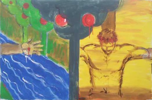
Time is an interesting idea, especially in painting.  Most forms of art are time based- music, theater, literature.  They all contain the element of time- a beginning, a middle, an end.  Painting is there all at once.  But we’re conditioned to read paintings in terms of time- as maybe snapshots of a longer story- so we insert our own sense of time.
But what about Jesus?  He seems to come into the story in the middle.  Hundreds, thousands of years of the history of God’s people happens before the world hears of the name Jesus in the sense we know it today.  The fact that He came at all is the result of the sins that we committed.  Cause / Effect.  Choice / Consequence.  Before / After.  Only what came ‘after’ was already there in the ‘before.’

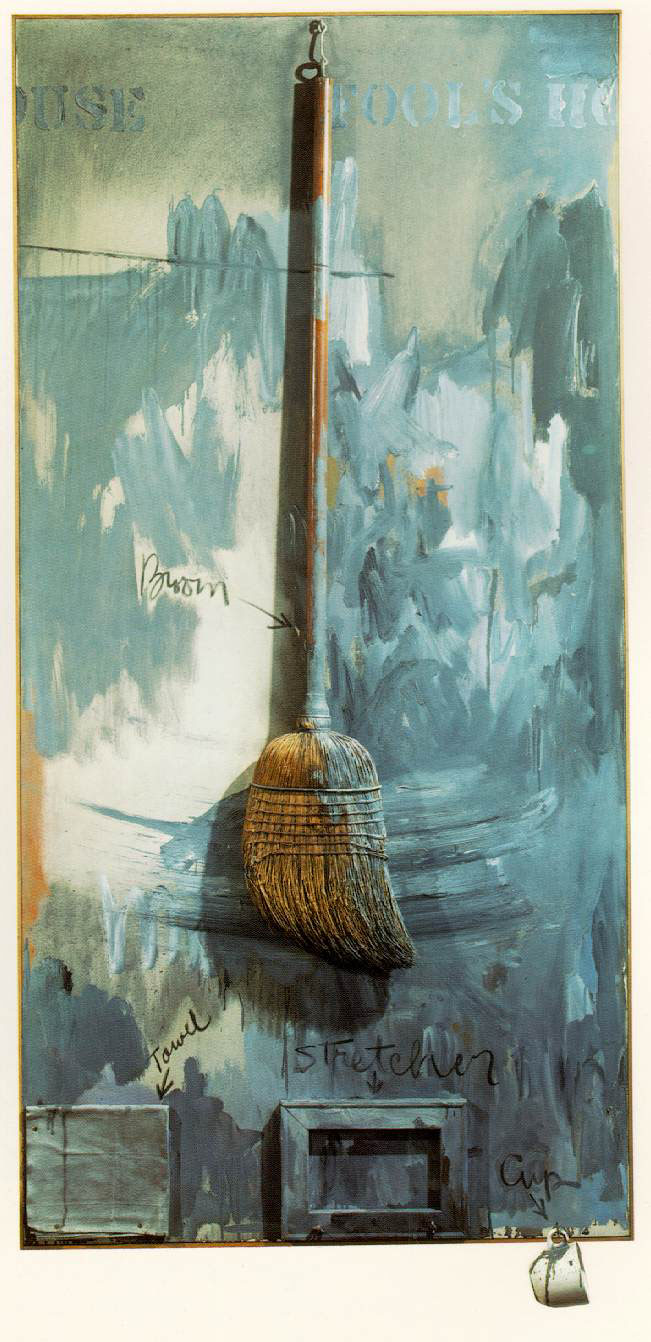
So I picked up something from an artist named Jasper Johns.  He would sometimes include writing or words in his paintings.  But often he would start a word on the right side of the painting but then have the word ‘wrap around’ and finish on the left side.  It was the complete opposite of what painting had been trying to do up until that point.  Before you went from a picture that looked like a view out of a window.  You knew the scene goes on past the edges of the painting even though everything is framed nicely within the picture.  The Impressionists took it even further by actually having people and objects cropped by the edge of the painting- similar to the way a camera does (Hmmm… can you guess what period the camera was invented?)

Even abstract art had a sense of infinity- that it could go on forever and ever.  But Jasper Johns thought of painting as an object all to itself.  It wasn’t being or looking like something- it was something itself.  So instead of going off to infinity- the words looped back around into the painting- containing it in its own reality. 
Jesus is the Alpha and the Omega.  There is nothing beyond Him.  If He goes off to one side… He ought to loop around to the other side.  He is contained by nothing else but His own reality.
So lets ‘read’ this painting.  The tree lies before you.  It is your choice to take or not to take.  On the left is the welcoming hand of Jesus, displaying the abundance of the paradise He created.  On the right is the result of taking the fruit- a dry desert that ends with Jesus hanging on the cross.  Or does it end there?  When His hand wraps back around you see His nail-scarred hand re-offering, through His death, the paradise that He is creating for you right now. 
The choice is yours.


FaithQuest 2010 – "Jesus as Substitute"

This series is regarding the paintings ‘performed’ during Faith Quest 2010.  The weekend revolved around a movie theme and the speakers played with different characterizations of Jesus as found primarily in the Gospel of John.  This painting was painted while Ryan Woods spoke on ‘Jesus as Substitute.’ 

With this one the image is pretty straightforward but the process was key.  Ryan actually started out trying to paint a self portrait of himself and the above picture is as far as he got.  Then I came in as ‘The Substitute’ and transformed Ryan’s ‘self’ into a picture of Jesus. (You can still make out some of the brown to the left of Jesus’ head that are the remnants of Ryan’s ‘hair’)


FaithQuest 2010 – "Jesus as Refugee"

This series is regarding the paintings ‘performed’ during Faith Quest 2010.  The weekend revolved around a movie theme and the speakers played with different characterizations of Jesus as found primarily in the Gospel of John.  This painting was painted while Jeff Medders spoke on ‘Jesus as Refugee.’

An inciting incident.
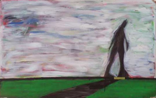
So there’s this figure.  He’s walking-plodding- through a dense, turbulent space.  The space is charged with all kinds of frenetic energy.  And he looks/feels lethargic.  Indeed, the paint used to depict the space around him is physically thicker than he is- he has thick matter to trudge through if he’s going to get anywhere.

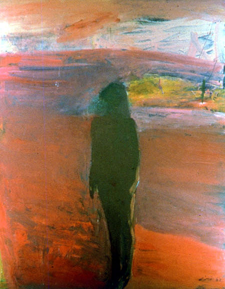
The imagery is culled from a combination of two artists- Nathan Olivera and John Millei.  Nathan Olivera has several paintings of figures standing in an abstract space.  His figures aren’t usually walking anywhere.  Even if they are they are vertical in orientation- the orientation of portraiture, of being.  Horizontality is the orientation of landscape, of journeying.  But the psychological aspect of his paintings are powerful, and I wanted to tap into that.

The second artist, John Millei, was one of my professors in graduate school.  He spent several years artistically analyzing and internalizing a series of frescos by the Italian Pre-Renaissance master Giotto.  The resulting paintings are very simple in terms of their basic elements- some ground for the ‘figures’ to walk on, the figures have been reduced to simple trapezoidal shapes, and then a colored background.  But the endless variety of treatments speaks to the fact that we are all essentially the same- working and moving within an endless variety of spaces and situations, both psychological and physical. 
In a couple of his paintings he incorporated either a gap in the ‘walkway’ or at least a section that had a different color.  And when I saw them, I was struck by the intensity of the relationship between the figure and this little space.  Most poignant for me were the times when the figures seemed to be just inching over the edge of this space.  So I tried to incorporate that in my image.  And the placement was important- it has to be just right.  And I think I got it because it’s teaching me right now.
Author Donald Miller in his book A Million Miles in a Thousand Years talks about the ‘inciting incident.’ In story-telling, particularly for movies, there has to be an ‘inciting incident’ that propels the character into his or her story.  It’s whatever happens that is the point of no return- they’re in it now.  And so as I’m looking at my solitary figure who has just inched passed this yellow space on his path, it excited me.  He just inched passed his inciting incident.  And that’s a good thing.  The space he’s in is not as threatening now.  Even though he may be struggling, caught in a dense but turbulent physical and psychological environment, it is not a moment of despair.  It is a moment of hope.  He is still moving forward.  And now that he’s past the point of no return you have this feeling that his endurance will pay off.  His story is just beginning.


FaithQuest 2010 – "Jesus as Warrior"

This series is regarding the paintings ‘performed’ during Faith Quest 2010.  The weekend revolved around a movie theme and the speakers played with different characterizations of Jesus as found primarily in the Gospel of John.  This painting was painted while Ryan Woods was speaking on “Jesus as Warrior.”


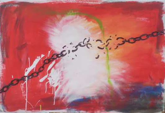
You’ve heard that a picture is worth a thousand words.  You’re about to witness how true that can be.  I was asked why there was a green swipe on the ‘chain’ painting.  I couldn’t really answer that then, partly because it would have involved far too many words than he (or I) were prepared for at that moment.  But here are all the associations that come to my mind that led to the decision to have a green brush stroke across the painting.
Artists are constantly aware of their historical lineage.  Each painting is in a dialogue, so to speak, with every painting that has come before it.  And sometimes it’s in the sense of listening- artists in the past will have done something and I want to know why; I want to understand it better.  And for an artist, the way to understanding is to do it yourself.  So I’ll consciously put things in some of my paintings to see if I understand what it’s all about- to see if it works in my own context and my own ‘words.’

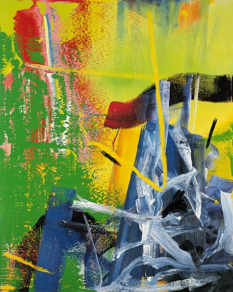
So in this case I was thinking about an artist named Gerhard Richter.  This guy’s work is all over the place in the sense that he does paintings that are as accurate and ‘realistic’ as a photograph, and other paintings that are totally abstract.  Most artists have a distinct style, he’s unique in that he has about a dozen distinct styles.  Anyways, he has a few abstract paintings that trouble me- I don’t really like them.  I don’t ‘get’ them.  Which means I need to do some of those paintings and try to understand them.  The green stroke is precisely that.

But there’s more.  Here’s kind of what he’s doing with the abstract brushstrokes and how I’m piggy-backing off that.  Way back with Picasso and people like him in the early 1900s artists started having an issue with the fact that they were trying to paint a 3-D world on a 2-D surface.  It became almost a moral issue with them- if you painted an illusion of 3-D space that was essentially a lie. It was dishonest because a painting is nothing more than paint on a flat surface and a true artist had to acknowledge that fact.  Abstraction arose partially to fulfill that conception- to not be something that it wasn’t, but to ‘be’ paint on a surface.  So Gerhard Richter works both with representational paintings and abstract paintings in an effort to make both of those endeavors equal.  Sometimes that happens in the same picture, where he has a ‘realistic’ painting with some abstract marks that lay on the surface and so the two aspects of painting lay side by side.

Yes- this is a painting.


What that means for me is a certain awareness.  That even when there is the illusion of space, there should be an awareness of the physical surface of the painting.  And so often we are like that in life.  We get so caught up in the illusion of things and life around us that we miss what’s ‘on the surface’ right in front of our faces.  So even though my ‘chain’ painting is mostly abstract, the abstract background gets subordinated somewhat to the chain.  It becomes like an explosion that is breaking the chain. And since it’s an explosion, it’s no longer abstract.  So the green serves as an abstract marking that has nothing to do with the chain or the ‘explosion’, but as something that lies on the surface and thus reveals that surface. It helps make us aware that there is more than the illusion.  It serves as a reminder to look at things a little different, to look away from what the world sees as ‘real’ and to see the literal truth right before our eyes.


FaithQuest 2010 – "Jesus as Provider"

This series is regarding the paintings ‘performed’ during Faith Quest 2010.  The weekend revolved around a movie theme and the speakers played with different characterizations of Jesus as found primarily in the Gospel of John.  This painting was painted while Jeff Medders spoke on ‘Jesus as Provider.’

Friendship.  Jesus as the Provider… and what He provides is friendship.  That was the idea behind Jeff’s talk – Jesus standing with the woman caught in adultery.  But how do you paint friendship?  I’m not sure I know (even after painting this image).  I went the route of something like a film still.  The moment pictured doesn’t say a whole lot on its own, but takes on more meaning as a reminder to those who know the whole story.  When you know the characters, who they are and what they’ve been through, then this benign image of a man and woman conversing in a friendly manner becomes more poignant. 
Abraham sending Hagar and Ishmael away by Rembrandt
The weird thing is painting Jesus in contemporary dress.  Rembrandt did that.  He painted Biblical scenes but all the characters were dressed like Rembrandt and his friends.  It doesn’t resonate as much with us because Rembrandt lived, like, 400 years ago.  But look at yourself in the mirror and picture Jesus and his Apostles dressed like that.  It makes it seem less serious to me.  It’s like his holiness doesn’t work unless He’s got His beard and robe.
But I thought I’d give it a go.  Jesus- short hair, t-shirt, no beard, and the woman caught in adultery- without a shawl.  Laughing together like good friends.